17 Oct The 3 Dos and 3 Don’ts When Using Canva
This post was written by Louis, our summer intern.
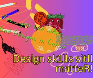
Picture this: you’re scrolling on social media and you see one of the most engaging graphics prompting you to purchase something from “Brand A.” Now, you scroll further and see a graphic from competitor “Brand B” using 12 fonts, neon text effects, a sunset cityscape background, and a drop shadow stronger than Hulk. The irony is both were made using Canva, so let’s talk about the do’s and don’t’s when you use Canva.
Do #1: Use Brand Kits
If you are designing for a brand, you know you must stick to their brand guidelines. One of the most helpful features of Canva Pro is your ability to add up to 100 “Brand Kits.” Brand Kit brings your entire brand together in one place, whether you’re starting from scratch or adding your existing assets. You can access your brand fonts, logos, colors, icons, imagery, graphics, and pre-designed Brand Templates within the Canva editor to apply the brand as you design. This feature is great for establishing brand consistency across platforms and people.
Don’t 1: Don’t Forget To Proofread
Typos stick out like a sore thumb, so make sure you proofread every part of your design. Unfortunately, Canva does not have a built-in spellcheck or grammar tool. Your design might look professional, but spelling errors can damage your credibility. We recommend you use an external tool to spellcheck, whether that’s downloading a Grammarly extension and giving it permission to be used in Canva, downloading your design and uploading it into Ch
atGPT to scan for errors, or copying and pasting your text into Google Docs.
Do #2: Design With Purpose, Not Just A Template
Canva gives you access to so many different templates for a myriad of design shapes and sizes, but it is crucial to remember why you are designing. Begin your process by determining what you want your design to do. Is it promoting a product? Showing off a recent event? Remember: designs should be intentional. Starting with a clear goal helps ensure your visual layout is making your purpose clear, from font to colors to icons.
Don’t #2: Two Is Company, Three Is A Crowd
Scrolling through all of the graphics, templates, photos, fonts, and such that Canva has to offer will make you feel like a kid in a candy store. While it is helpful to have those all at your fingertips, keep in mind that less is more. Save some of the icons and graphics for the next design, because you don’t want to overcrowd what you’re currently working on. Try to limit your fonts to no more than two. We don’t want the viewer to be overwhelmed; instead, we want them to easily digest the message. One is calm, two is company, three is a crowd, and four… that’s just chaos.
Do #3: Streamline Your Campaign In One File
Can you juggle flaming torches? We know that’s what it can feel like when you are designing a campaign for multiple platforms. Instead of having to bounce back between your Instagram post, billboard, flyer, and rack card, Canva now has a feature to keep all of those sizes in one design. When you are designing in Canva and want to create a new element for a campaign, navigate to the “Add Page” button, and on the right you will see a dropdown arrow. Using that dropdown, you can select which size you want the next page of your design to be. Now you can have all of those different-sized elements in one file and on one tab. This makes it easier to save all elements together, share for review, and see the cohesion.
Don’t 3: Don’t Forget Your Individuality
Again, Canva’s templates are a phenomenal resource, but don’t forget to add your brand’s flair. Think of a template as a starting point. If you just replace the placeholder text, you are putting yourself at a red flag risk: your design might look exactly the same as everyone else’s, and you will get lost in the mix. Don’t forget to swap the fonts and colors of the template to match your brand, and continue to customize the template to your liking. Consider switching some elements, tweaking the layout, and replacing placeholder images with your own. You don’t want your design to be identical to everyone else’s. You want it to be memorable, and to reflect your YOU-ness.
At the end of the day, Canva is just like Spiderman – “With great power comes great responsibility.” Remember these do’s and don’t’s the next time you need to design with confidence on Canva.
Have a design dilemma? Need help getting your brand out there? That horn of yours ain’t gonna toot itself! Book a call with Advokate at advokate.net/date