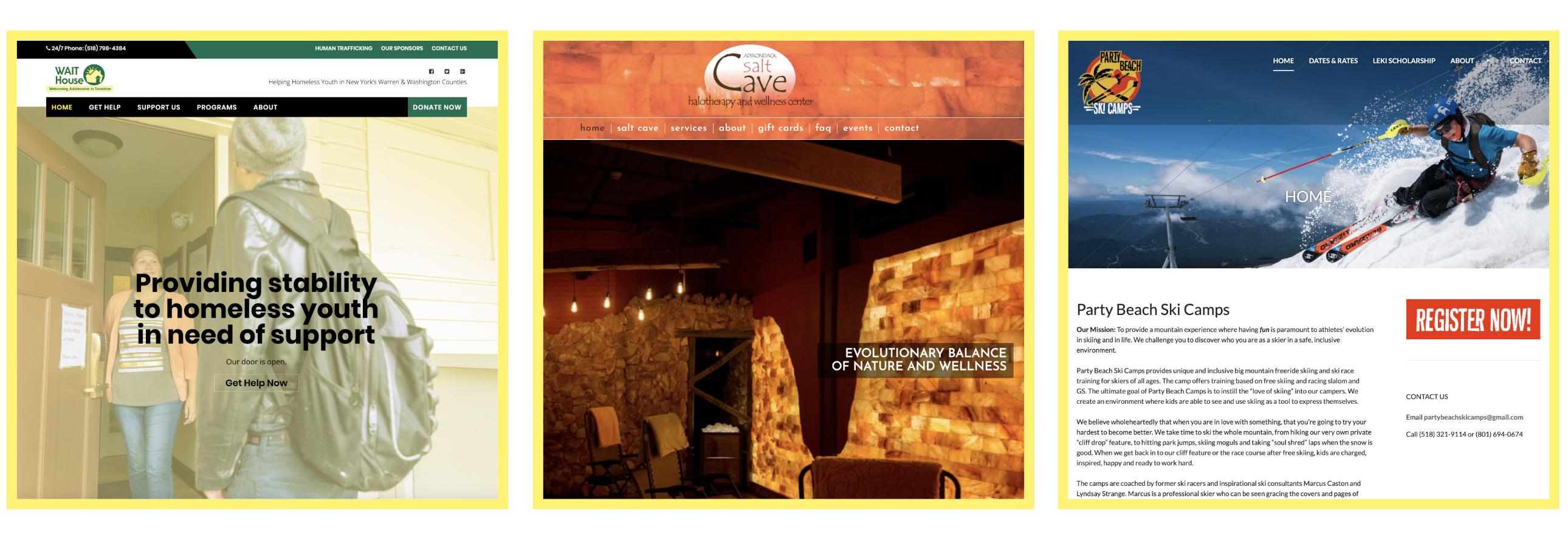
17 Jul 3 Tips For Show-Stopping Web Design
In today’s fast-paced online world your website is your calling card. If it’s not immediately engaging, intuitive to use and mobile-friendly people will click off. Social is media is king right now but sales are being made on websites. The point of social media is to warm up your audience and lure people in so they buy into what you are selling.
If they follow your Instagram to your website and it’s clunky this will say a few things about you: You’re out of date, maybe they can’t trust you, maybe you don’t see a lot of traffic and therefore aren’t experienced. This is especially true for Millenials and Gen Z.
People don’t have the time or patience to figure out how to work your site. Make it easy for them.
Not sure if your site passes? Try it out like you were a customer. Use your desktop, laptop, tablet, and phone. Have a friend try it. The great thing about the internet is it’s always changing, you can always improve!
Here are 3 tips to get you started:
1. Responsive design
Responsive design is a single design that flows across all devices rather than creating a different design for each device. The goal of responsive design is to build web pages that detect the visitor’s screen size and orientation and change the layout accordingly. Building your website this way can increase the traffic influx from search engines. More people will come to your site and stay on your site. If a website isn’t mobile-friendly then people will get frustrated and click-off taking their purchasing power with them.
You can test your own website on different devices to see how they work. It’s good to check-in and see how your clients utilize your site. You can then tweak from there or better yet bring it a web designer/developer to update your current website.
Importance of responsive design:
-
- Faster webpages
- Improved SEO (Search Engine Optimization)
- Lower maintenance needs
- Lower bounce rates
- More user-friendly experience
- Higher conversion rate (turning visitors into customers)
2. Hotel lobby vibes
Think of the homepage like the hotel lobby. Visitors don’t want to linger there; they want to find their room or go to the bar, restroom or restaurant. As a jumping-off point, a company’s homepage should be well designed, easy to navigate and packed with informative content and calls to action that lead the “guest” deeper into the site.
Your homepage is typically the first point of contact a consumer has with a company and the single most important page on most websites.
At the bare minimum, your home page should have a clear call to action, and important keywords such as your location and what your website is about.
Call to action examples:
-
-
- Call today
- Let’s chat
- Email us
- Shop now
- Book now
- Get directions
- Find out more
-
3. Add video or animation
People these days love to be shown not told. Including movement on your homepage will immediately show people who you are, what you do and WHY you do it. Video keeps people on your site longer. The content is quick, informative and easy to digest.
This type of accessibility can earn the trust of potential clients and showcase aspects of your business that current clients may not be aware of. Also, it’s entertaining!
Deliver your message quickly, build relationships with your clients and stand out from the crowd!
Ideas for homepage video:
-
- Highlight employees
- Interview clients (testimonials)
- Show off your space
- Snippets of your work (works in progress, before and after, etc)
- Unbox new products

P.S. Advokate hosts monthly workshops! Join us for hands-on learning about how to make your business grow and thrive! Click here to learn more: advokate.net/workshops


