29 Oct What The Heck Are Submarks And When Should You Use Them?
Most people use the term “logo” to refer to any image or mark that represents a brand. In reality, these variations all have different names and usages. A logo is defined as a graphic mark, emblem, or symbol used to aid and promote public identification and recognition. Logos are great for the big stuff: websites, banners, letterhead, packaging, invoices, print ads, etc. but sometimes you need a variant for the smaller stuff or maybe your brand recognization is on point and you’re getting bored with just one logo variant. This is where submarks come in.
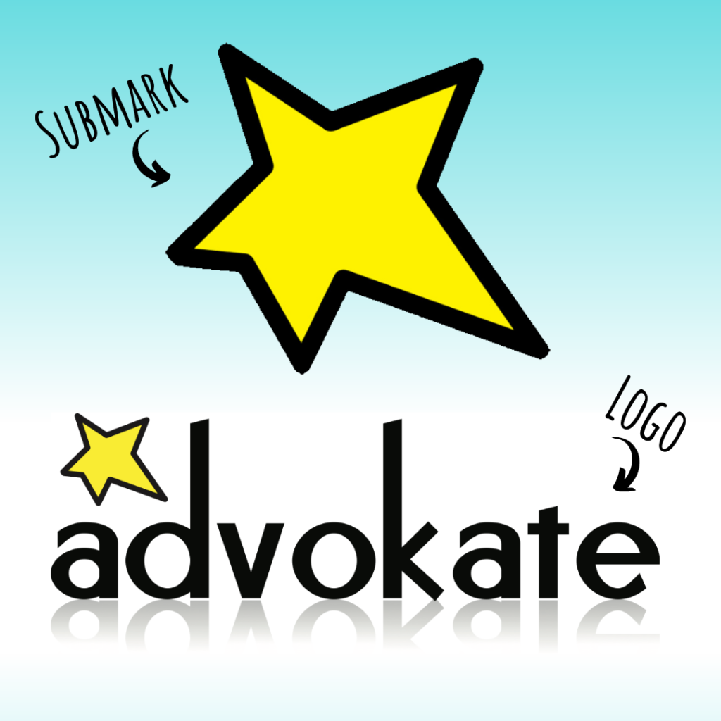
The most common logo variation is the submark. Well, what the heck is that? Generally speaking, a submark is a simplified version of your logo that can easily be used on a smaller scale.
Your submark is not a second logo. It’s more along the lines of an extension of your primary logo. It is common for a submark to eliminate text and/or re-arrange elements from your logo without straying too far from the original aesthetic. It is an extension of your branding that not only gives you flexibility when it comes to scale but actually helps with brand recognition.
You want your submark to look and feel like your primary logo and fit cohesively with the entirety of your branding. This means utilizing the same fonts, color scheme, textures, and overall stylistic choices throughout all of your branding but don’t overthink it!
Some folks get SO hung up on proper branding that they don’t allow for flexibility to make the best impact in the medium they’re using. I mean, definitely, you want consistency when it comes to “Is earth tones my thing or poppy pastels?” and the shapes in your logo, but you can “theme” it a little bit to do the best job in the environment it’s in.
Think of it this way, most people have a certain style of dressing that translates across their wardrobe. You wear different things when you work out than when you go to dinner but your outfit always reflects your tastes. Your branding is your business’s outfit.
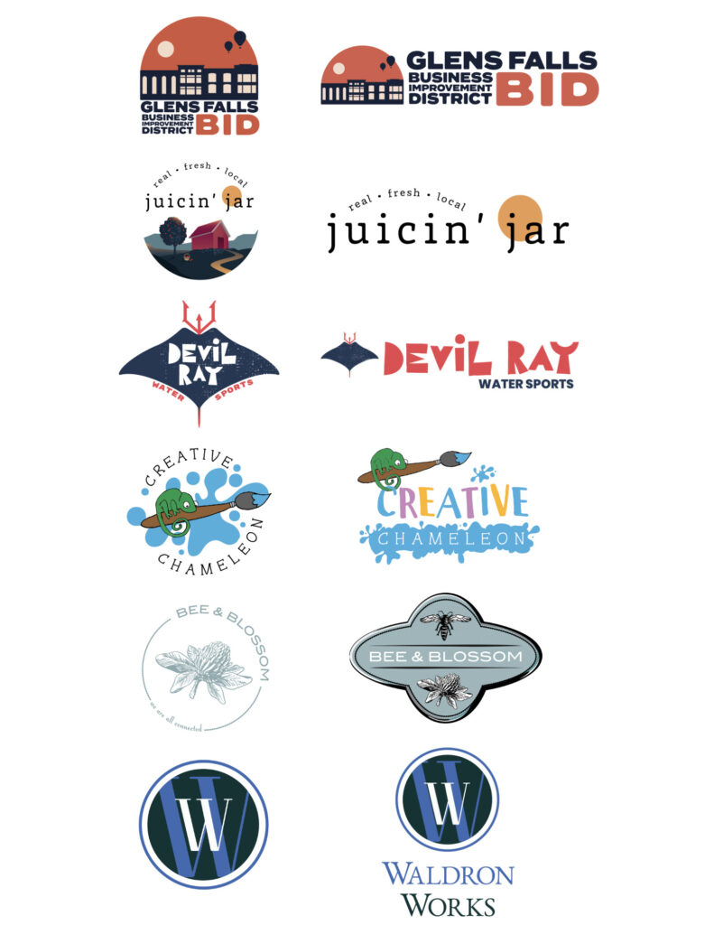
Examples of Advokate-designed submarks
Primary logos on the right. Submarks on the left.

- Social media profile pictures
- Smaller merchandise like stickers or magnets
- Website favicons
- Website footers
- Backs of business cards or t-shirts
- Email signatures
- Watermarks
You can even have a submark for each one of the services you provide.
Remember, your submark should contribute to your overall brand strategy and not distract, so don’t overuse it. Strategically use it where it makes the most sense. You don’t need to stick to design “rules” but keep in mind that the most effective submarks utilize both text and iconography. If you want to stay current or add a fresh pop to your brand, adding a submark can be an incredible strategy when you know you want to stay up-to-date but don’t want to lose your established brand recognition.
Interested in creating or refreshing a logo or submark? We can help!

