23 Feb Five factors that make a good logo!
Logo design is about more than just aesthetic preference. A logo should help your business stand out and be memorable in a crowded marketplace. When considering your business logo, there are five essential factors to consider:
1. Readability
When choosing a design for your logo, one of the most important things to consider is readability. Making sure a design is easily understood by a wide audience is important for your brand’s accessibility. When more people understand and relate to your design, different types of clientele will be attracted to your business. When applying readability to a visual design, make sure the logo is simple, high-contrast, and has space to breathe.
Many elements are included in logo design: Text, color, imagery, and subtext. All elements of the design should be easy to understand and recognize. Here are some awesome examples of readable designs:
![]() Baskin Robbins has a great logo. The color choices help consumers understand what the company sells. The mid to dark tone on a white background offers great contrast. The font is fun and shows personality while still being legible. Also, the “31” mixed into the “BR” of Baskin Robbins is skillfully done, not losing readability while still nodding at Baskin Robbins’ 31 flavors, which are integral to the brand!
Baskin Robbins has a great logo. The color choices help consumers understand what the company sells. The mid to dark tone on a white background offers great contrast. The font is fun and shows personality while still being legible. Also, the “31” mixed into the “BR” of Baskin Robbins is skillfully done, not losing readability while still nodding at Baskin Robbins’ 31 flavors, which are integral to the brand!
![]() FedEx is another logo that accomplishes readability. The color choices of the purple “Fed” and orange “Ex” have enough contrast that the words, which lack space between them, don’t get lost in each other. The hidden arrow is also clever and easy to spot once you see it for the first time, again aligning with the integral idea of the brand, that the company is always moving your packages forward.
FedEx is another logo that accomplishes readability. The color choices of the purple “Fed” and orange “Ex” have enough contrast that the words, which lack space between them, don’t get lost in each other. The hidden arrow is also clever and easy to spot once you see it for the first time, again aligning with the integral idea of the brand, that the company is always moving your packages forward.
2. Scale
When thinking about a design for your brand, consider how it will be used. When something is designed to go on a large billboard, it might be too detailed to be recognizable when you decide to also make it a decal on tiny T-shirts. If you know the design you want will only go on the side of a truck, where small details can be easily interpreted, we can design to that! If you know your logo will go on multiple-sized and -shaped surfaces, the scale of the design is crucial.
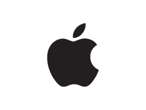 The Apple logo is a good example of scalable design. The design’s simplicity — just one color and streamlined to fit the sleek tech look of the brand — allows it to easily be used on a ton of different products, including cell phones, MacBooks, desktop computers, and tiny AirPods. Sure, not all designs can be this simple and most logos need text to be recognizable, but Apple knew what purpose its logo served when thinking about the icon. Especially since its logo is a redesign of the original that looked like …
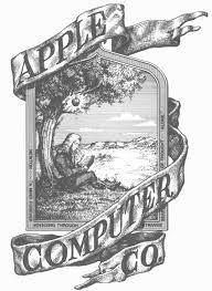 … this! Although this design is AMAZING and much more illustrative and unique, it would not have been good for the company’s products and vibe. Imagine this entire etching going on the side of your tiny AirPod; it would get completely lost! Other elements of this design, it could be argued, are better than the current design, but on scalability alone, the rebrand was an incredible choice that helped launch Apple into becoming a staple of technology.
3. Space
Space refers to the area a shape or form occupies, and it’s important for a few reasons in logo design. The silhouette of a design is important because when scaled down or used in a single color, the design should still be recognizable. The negative space is also important because a design needs ample space to “breathe.” A design that is too cramped becomes messy looking and hard to read. This is important for both the text and the icon. The space between letters and lines in type is extremely important, and designers are almost always manipulating those spaces for the best outcome!
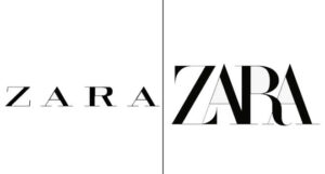 Zara’s logo is a popular redesign for all the wrong reasons. The logo had space between letters in a serif font, which helped with the “airy and minimalistic” vibe for which the company was striving. In 2011, Zara decided to take a different direction with its clothing and branding. The company chose a font with a thin stem on one side and a thick stem on the other, while also overlapping the font, sparking controversy. Zara wanted a more edgy and fashion-forward look. Some believe the company succeeded, while others think the move made the logo messy and hard to read, especially on small clothing tags. There are times when design rules can successfully be broken, but the consensus on the Zara redesign is that it missed the mark and suffered on the readability front because of it.
4. Timeless
Remember when shutter shades were a thing? Trends are important to take into consideration when deciding on a logo design. Especially in this digital age, trending is a fantastic tool that can help launch your business into the spotlight. Relying on trends, however, can be risky. Trends come and go so fast, they’re not always easy to rely on. If you are creating a brand identity based on a trend, it may not last long. We’re all for creating a logo that is aesthetically interesting, modern, and unique, but when considering a lasting look, it is always best to rely on tried-and-true principles of design.
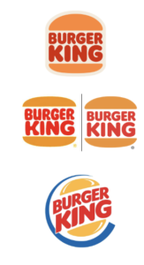 Burger King has an interesting history of redesign. The company had its longest-running logo from 1969 to 1994, which it returned to with slight changes in 2020. In 1999, Burger King went with the extremely recognizable logo with a blue circle and slanted text. That look was super trendy and relevant to the late-’90s and early 2000s style of design, which valued dynamic text, bold colors, and extreme highlights. This may be the design many people prefer because of aesthetic preferences, nostalgia, or brand recognition. Returning to the old design was, to us, extremely successful especially with updated marketing to match more subdued and retro-looking colors. Trends influenced both designs, as with most artwork, but the revamped old design follows tried-and-true design principles. This logo has a great silhouette, it’s easy to tell what it is, has great contrast, and the use of space between the buns and text is done well. Whatever your preference, considering what look will be best for your brand now while still being thoughtful about future-proofing is a balancing act. By considering what trends influence you and if they’re long-lasting, this can be done well.
5. Identity
The most important factor of your logo is being sure of the aesthetic preferences and voice of your business. Following design principles and having a logo that looks great are important, but if the logo doesn’t fit the vibe of what you want to sell, there will always be a disconnect. If you are trying to start a tech company that is sleek and hip, you might want your branding to be simplistic with sans serif fonts, and a recognizable icon. If you want your business to be a vegan ice cream brand with a youthful voice, you might want fun colors, interestingly-shaped text, and illustrative aspects to the logo.
All aesthetic preferences can be made into amazing logos with unique voices and still follow rules that work. Start by really pinpointing the voice of your business, who your target audience is, and what you want to achieve. We suggest having a moodboard for the visual side of things! We love Pinterest to track design preferences and use it as a tool to see what our ideas have in common.
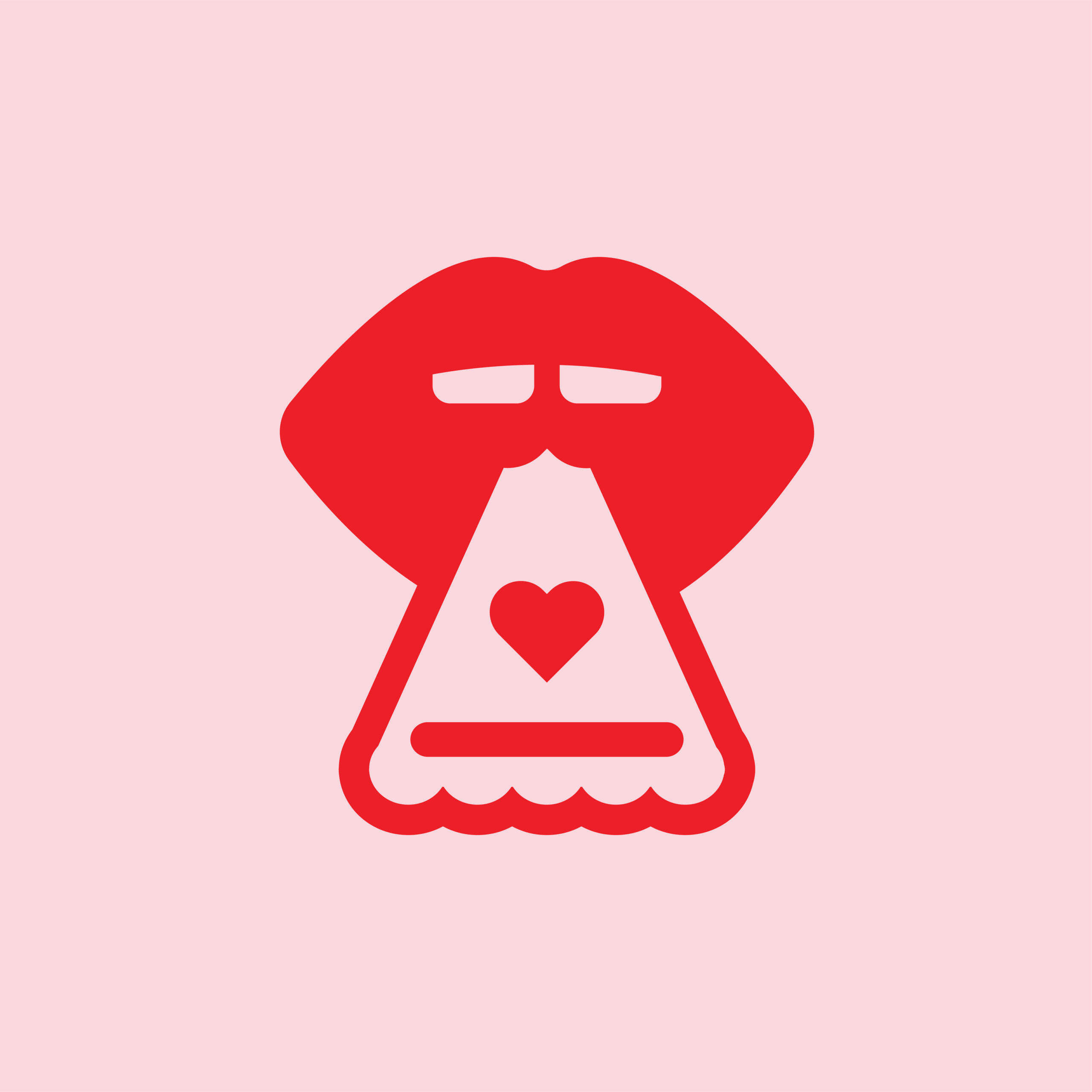
 Comparing Moe’s to Chipotle illustrates this point well. Both sell the same type of food, offered in the same way, and have dine-in or takeout experiences. Moe’s, however, has a more fun and family-centered experience with loud colors, interesting shapes, and crazy artwork. This is mirrored in the company’s logo with uneven shapes, fun bold colors, and a bold black outline.
![]() Chipotle is catered more toward cool adults, and is marketed as a healthier option. With this, the logo is sans serif, has a subdued red, an artistic pepper icon and a more uniform shape contained in a circle. Both companies know their audiences, and chose their branding and logo design based on that knowledge. Both designs are successful because the companies know their voices and use that knowledge advantageously.
Chipotle is catered more toward cool adults, and is marketed as a healthier option. With this, the logo is sans serif, has a subdued red, an artistic pepper icon and a more uniform shape contained in a circle. Both companies know their audiences, and chose their branding and logo design based on that knowledge. Both designs are successful because the companies know their voices and use that knowledge advantageously.
Designing a logo for your brand is such a fun and exciting experience. Knowing some background principles will help you make more informed decisions. Advokate can help you learn more design principles and be a helping hand in making your dream logo a reality!